Web designing (the HTML & CSS part, not the Figma Part) can be a real pain if we don’t understand the design system/rules/procedure it uses. Even after watching HTML and CSS tutorials, we can still struggle to design anything in web. But, after having a decent understanding of divisions into rows and columns and learning about display properties and positioning in detail, you we can have some confidence to turn any Figma design to HTML and CSS. This is not a tutorial on HTML & CSS but a comprehensive usage of them. By reading this blog, I hope you can get the confidence and create the Mental Model of Web Design in your Brain ✨
This Blog also serves as a very precise summary of long web design bootcamp I took with **GenosisX Tech Community, watch here**
TL;DR: Create proper rows and columns for each block of design, put them into proper semantic tags or
<div>tags. Use display flex or grid on them. Then style them properly with the fonts, colors, paddings, margins, borders, backgrounds. Position them properly with position property of CSS. Use responsive features of flex and grid. Done!
Prerequisite
- Basic knowledge of HTML and CSS would help, but not necessary.
- That’s It!
Guide to Divisions
Making proper divisions of design into rows and columns will help you style them better and will make it 100x easier to make them responsive. Let’s get into it.
Visualize Design

Visualize Design #1
- First think of the separate sections, in this case, there are two, a Header and a Hero section.
- For every block of divisions, first think of sections as in one row or one column, then multiple columns or rows respectively.
- Divisions
- Here, the whole page is one column which has two rows, Navbar and Hero.
- Then we clearly see, hero is divided into two columns, so hero itself is one row which has two different distinct columns.
- You can try to dig further deep into each div visually.
So based upon the divisions, we can conclude the following code.
<body> <!-- First Column, whole page -->
  <header></header> <!-- First Row, Header -->
  <main> <!-- Second Row, Hero section -->
        <section></section> <!-- First Column, Main Text Section-->
        <section></section> <!-- Second Column, Main Image Section-->
    </main>
</body>
Lets dig deep

Visualize Design #2
- Divisions - Header - a row
- Img - Logo - First column
- Navbar - Second column
- Button - Third column
<body> <!-- First Column, whole page -->
  <header><!-- First Row, Header -->
    <img src="/.." /> <!-- First column -->
    <nav>bunch of <a></a> Tags</nav> <!-- Second column -->
    <button>Sign up</button> <!-- Second column -->
  </header>
  <main> <!-- Second Row, Hero section -->
        <section></section> <!-- First Column, Main Text Section-->
        <section></section> <!-- Second Column, Main Image Section-->
    </main>
</body>
Use semantic tags wherever possible, they hold some meaning and are very important for SEO, read this article to learn more about them. https://www.pluralsight.com/guides/semantic-html
Visualize Design #3
- Divisions - Main - a row
- First Column of Hero Section
- H1 - Main text - First row
- p - Description text - Second row
- span - Third Row having two buttons
- Button - First Column
- Button - Second Column
- Second Column of Hero Section
- img - First Column
- First Column of Hero Section
<body> <!-- First Column, whole page -->
  <header><!-- First Row, Header -->
    <img src="/.." /> <!-- First column -->
    <nav>bunch of <a></a> Tags</nav> <!-- Second column -->
    <button>Sign up</button> <!-- Second column -->
  </header>
  <main> <!-- Second Row, Hero section -->
        <section> <!-- First Column, Main Text Section-->
      <h1>Main text...</h1>
      <p>Description text...</p>
      <span>
        <button>Get Started</button>
        <button>Order Now</button>
      </span>
    </section>
        <section> <!-- Second Column, Main Image Section-->
      <img src="/.." />
    </section>
    </main>
</body>
Guide to Style them
Pat yourself if you reached till here, and understood everything above! Lets go ahead.
For the next part, I’ll use tailwindcss because it’s easier to explain with. If you know CSS, you basically know tailwindcss. Read this article for a quick introduction, I hope you come back here after reading this. https://tailwindcss.com/docs/utility-first
Step-by-Step Linear Process to Design Anything!
Remember, this is not a hard and fast rule to follow exactly as is. You can add you own flavours to this. Skip steps which are not required. I made this using my personal experience so add modify it if I missed anything.
- Write HTML, using the divisions approach
- Set background color
- Set display - flex (if any child tags)
- Set width - compulsory
- Set height - optional
- set overflow properties
- Set font → size, weight, line height, letter spacing,
- Set text colors → paddings → borders → margins
- Colors - normal, hover, active any states
- Borders - width/thickness , color, radius, style
- Set position (if want to move the element from its position)
- relative - move it from its current position
- absolute - move it from its first relative parent start point (top-0, left-0 of relative parent)
- fixed - move it from windows start point (top-0, left-0 of whole window)
- Set z-index - define stack, which element should be above which
- Anything else that suits your design
This is a linear process, which means you first style the first tag then the second tag then the third tag then the next tag then the next tag and so on!
<body> <!-- First style this #1 -->
  <header><!-- then this #2 -->
    <img src="/.." /> <!-- Then this #3 -->
    <nav> <!-- Then this #4 -->
      <a>..</a> <!-- Then this #5 -->
      <a>..</a> <!-- Then this #6 -->
      <a>..</a> <!-- Then this #7 -->
    </nav> <!-- and so on till the last tag -->
    <button>Sign up</button>
  </header>
  <main>
    <section>
      <h1>Main text...</h1>
      <p>Description text...</p>
      <span>
        <button>Get Started</button>
        <button>Order Now</button>
      </span>
    </section>
        <section>
      <img src="/.." />
    </section>
</body>
Here comes the CSS

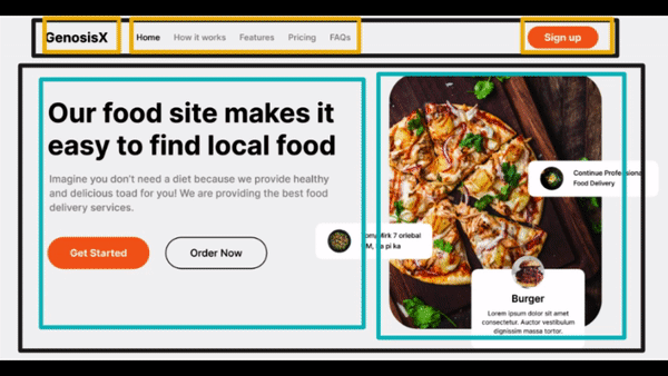
Web Design Bootcamp Design
Take a quick look, and we will start with the linear process
Body - main page
We can see that the
- background color is different
- width is full screen
- padding left and right i.e x-axis
<body class="bg-[#f3f3f3] w-[100vw] px-16 " > <!-- First Column, whole page -->
  <header  ><!-- First Row, Header -->
    <img src="/.." /> <!-- First column -->
            ...
Header
Here,
- We see, everything is in one row, so set display as flex
- width is full available space so 100%
- img - logo
- width of some pixels
- navbar
- width of fit content (automatic)
- font weight is medium i.e 500
- Color is gray for all but black for current one
- button
- background is orange
- text is bold
- longer padding in x-axis, shorted padding in y-axis
- border radius full rounded
<body class="bg-[#f3f3f3] w-[100vw] px-20 " > <!-- First Column, whole page -->
  <header class="flex w-full" ><!-- First Row, Header -->
    <img class="w-20" src="/.." /> <!-- First column -->
    <nav class="flex w-fit text-[#828282] font-medium" >
      <a id="current" class="text-black" >Home</a>
       <!-- if id="current" then class="text-black" add this login using javascript  -->
      <a>How it works</a>
      ...
    </nav> <!-- Second column -->
    <button class="bg-[#FF6F1E] w-fit text-white px-4 py-2 rounded-full" >Sign up</button> <!-- Second column -->
  </header>
     ...
We won’t do the whole design, but this will give you enough idea on how we go about designing and how to follow the linear process which may seem overwhelming but is really easy to follow.
Responsiveness, how easy is it?
Desktop First Design Approach
- First we design the desktop version of our web app
- Then slowly add rules to make it responsive for tablets then mobile
- Desktop → Tablet → Mobile
- This is not recommended
Mobile First Design Approach
- First we design the mobile version of our web app
- Then slowly add rules to make it responsive for tablets then desktop
- Mobile → Tablet → Desktop
- This is most recommended and used by tailwindcss by default
No media query methods
- Set max-widths and min-widths
- Use display flex with flex-wrap, flex-grow, flex-shrink, flex-basis
- Use display grid with grid-template-columns, repeat - autofit, minmax
- You can much deeper with maths to avoid media queries but I feel that much is unnecessary.
- Using some media queries to avoid extreme complexity is always a good idea
A good example of minimum media queries
****The prefix lg: is how we use media queries in tailwindcss, refer this* https://tailwindcss.com/docs/responsive-design
<main class="flex flex-wrap text-lg lg:text-xl m-5 lg:m-10" > <!-- Second Row, Hero section -->
        <section class="max-w-lg" > <!-- First Column, Main Text Section-->
      ...
    </section>
        <section class="max-w-lg" > <!-- Second Column, Main Image Section-->
      ...
    </section>
</main>
Get Creative with Positioning
When we want to move some elements from their original position to something else, we use position property.
CSS Positions
- Static
- Default value
- Original position, cannot change it.
- Relative
- Set explicitly
- Can change position from original using properties - top, left, bottom, right
- Moves towards the specified direction from its current position.
- Absolute
- Set explicitly
- Can change position from original using properties - top, left, bottom, right
- Move towards the specified direction from the first relative parents start coordinates.
- Fixed
- Set explicitly
- Can change position from original using properties - top, left, bottom, right
- Move towards the specified direction from the coordinates of window (browser tab) itself
- Does not move on scroll, stays fixed.
This article by MDN teaches all positionings perfectly. https://developer.mozilla.org/en-US/docs/Web/CSS/position
An example of positioning
Lets look at the image which has blocks of elements floating above it.
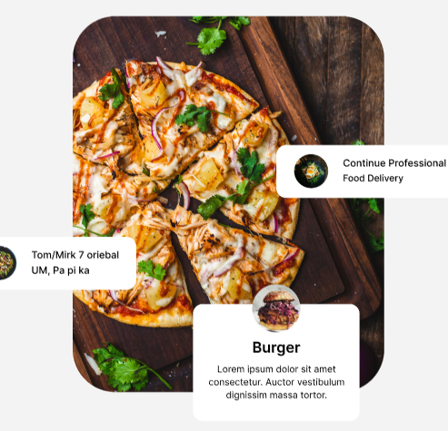
- So the concept is we wrap the image in one div
- This div will be set to position: relative
- This div will contain image tag and other elements of those floating blocks
- Don’t change image tag position
- Change position: absolute of all floating elements
- Then set them to their places via top, left, right, bottom
<section class="relative" > <!-- Second Column, Main Image Section-->
        <img class="w-24 h-40"  src="/.." />
        <div class="absolute top-[30%] right-[-10%]" >...</div>
        <div class="absolute top-[50%] left-[-10%]" >...</div>
        <div class="absolute bottom-[-15%] right-[12%]" >...</div>
</section>
Conclusion
- Make proper divisions while writing the whole HTML. Visualize and then create rows and columns.
- Write whole HTML of one section then style the whole section using the step by step linear process.
- Position properly and most of it depends on the parents element position property, so make sure you set those correct.
- Learn flex, grid and positions of CSS very thoroughly.
- Learn tailwindcss because it will make your life easier, trust me on this.